Hand Hygiene Dashboard and Reports
Your account comes with a dashboard, reports and analytics. Data collected are immediately updated in the reports.
There are 5 standard monthly reports:
- Compliance by Audit Site
- Compliance by Audit Site Group
- Compliance by Profession
- Compliance by Profession Group
- Compliance by Moments
There are also 5 standard trend reports
- Compliance Trend by Audit Site
- Compliance Trend by Audit Site Group
- ComplianceTrend by Profession
- Compliance Trend by Profession Group
- Compliance Trend by Moments
How to access these reports
Step 1: Login to your account.
Tip: You must have “Reports Analyst” role before you can access this module. If you do not see the Reports module on your Homepage, it means you do not have permission to view Reports. Please check with your Administrator to get access rights.
From the Homepage, click on the Reports Module.
You will be taken to the Dashboard as below:
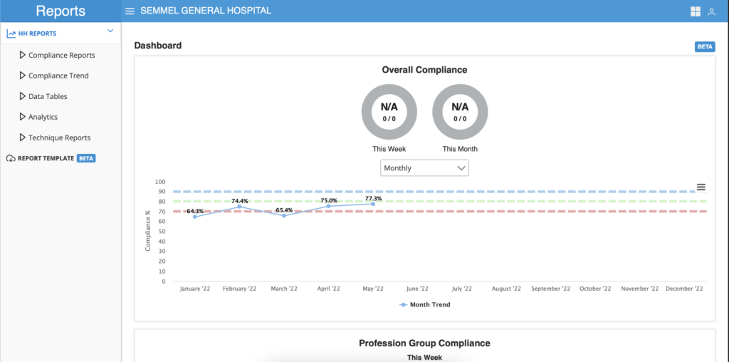
Step 2: Click on the HH Reports menu on the left to see a dropdown list of all the standard charts. For trends, click on the Compliance Trend to see a dropdown list of all the standard trend charts.
How to perform analysis on each chart?
You can drill down further to gain insights into the staff performance. See the chart below as an example.
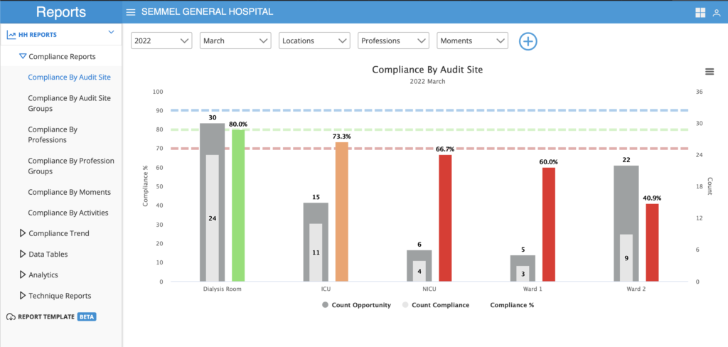
In March 2022, Ward 2 has has collected 19 opportunities and 13 compliance. The performance at 40.9% is below the Threshold line and therefore is in red.
You can click on the red bar to find out which are the Professions that have contributed to the 40.9% score. The image below shows the list of Professions who have contributed to that score in the month of March.
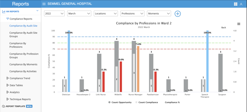
From this drill down, you can see which are the Professions that have not performed well to give feedback.
Tips:
- Click on the “Back” button on the top right corner of the chart to go back to the main chart.
- You can drill down to analyse performance on all the charts except trend charts.
Analytics
The charts in this section gives you a more in depth look at the quality of your data.
Auditor Productivity Chart

The Y axis of this chart represents 24 hours in a day and the X axis represents the dates of each month. The number in each of the bubble represents the total opportunity collected on a particular time and day. Mouse over each bubble to see the detail.
High quality data will show the bubbles are dispersed throughout the 3 shifts in a day, 7 days in a week and every day of the month. Any concentration of data is likely to represent bias.
Use the Auditor filter to see the data collection pattern of a particular auditor.
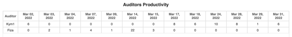
The Auditor Productivity Table will have a column for each day that data is collected and the name of the Auditor who collected it.
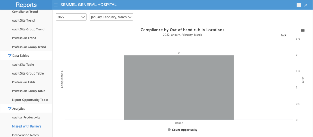
Missed with Barriers Chart
If you have turned on the function to collect data on barriers to compliance, you can analyse it in this charts.
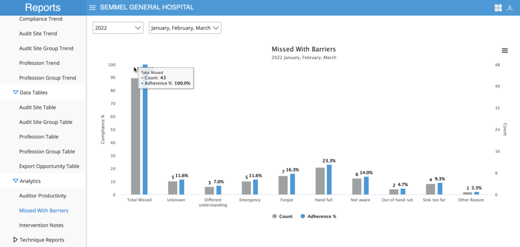
In this example, for the months of Jan, Feb and Mac, you have a total of 43 missed events. Out of the 43 events, 5 have unknown reasons, 3 had a different understanding, 5 said that it was an Emergency and so on.
Click on any of the bar to analyse which Professions or which Sites have recorded these barriers. See example below:
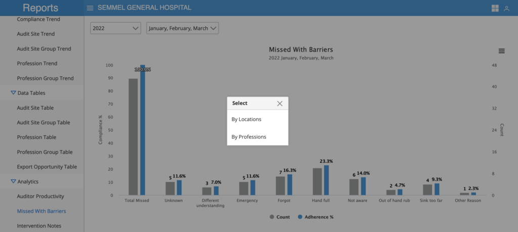
If you click on “Out of hand rub”, a dialogue box will pop up to let you further breakdown the report based on Locations (ie, audit site) or Profession. Click the “By Location” dialogue and a new chart will show you the locations in which it was recorded as Out of hand rub. See image below.